Declutter Your Website: 6 Tips for a More Conversions
Apr 11, 2025
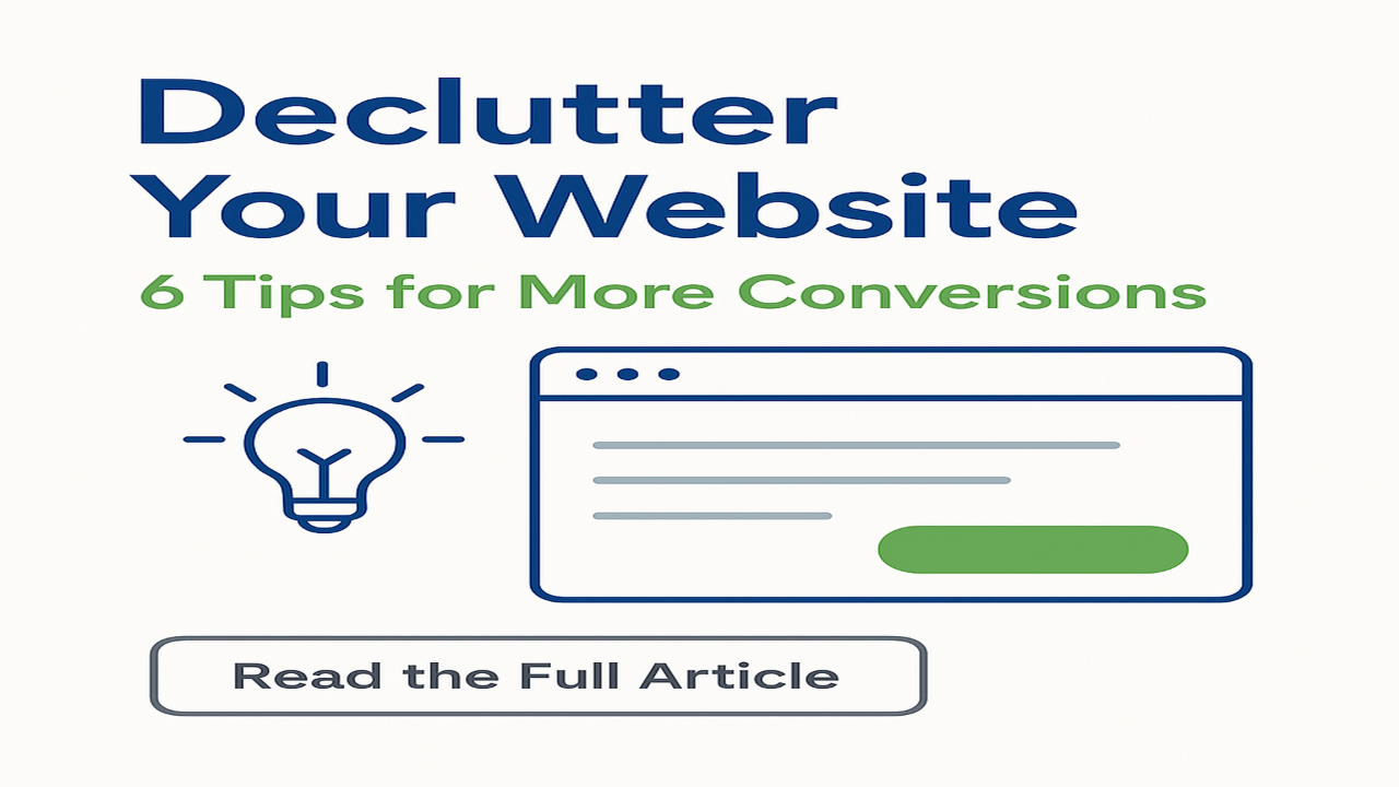
Declutter Your Website: 6 Tips for a More Conversions
"You never get a second-chance to make a first impression." We’ve all heard it before, and it’s never been more true than when it comes to your business website.
When a potential client lands on your website, they make an instant judgment about you, your professionalism, your ability to solve their problem, and whether you’ll “click” with them.
Take a moment and think about the last time you cleaned out that one junk drawer at home—it felt good, right? Imagine applying that same satisfying clean-up to your website.
Just like cleaning up the junk drawer, it’s not about making it look good, it’s about function. And sometimes looking good is what helps the function of your website. (No guarantees that’ll work for your junk drawer—although it might!)
As a small business owner, you know your website is crucial to making connections, marketing your business, and generating sales, but with everything else on your plate every day, it can easily become a cluttered mess of outdated offers and overwhelming choices. Just like that junk drawer, your website could probably use a springtime tidy-up to make sure it's making the right impression and, more importantly, converting visitors into clients.
Why streamline? A cluttered website can confuse potential clients, hiding your essential services under layers of outdated content. If you’re seeing a drop in appointments or queries (or maybe your website has never performed as well as you wanted), it’s time to declutter.
1. Streamline Navigation
Imagine a visitor stepping into your lobby—you’d welcome them in and start building a connection, right? Your website should do the same. Welcome them in by making things simple! Everyone is busy and overwhelmed by too many choices throughout their days today.
Simplify your navigation bar to the bare essentials to help visitors find their way around with ease. Connect with your audience first with the ONE thing that is MOST helpful to get started. Once you’ve made the initial connection, you can offer other services or products that are useful to them.
2. Clear Out Old Content
Remove anything that doesn’t add value or drive towards a booking or a call. Highlight the benefits of your services and why you stand out from your competitors. Keep the narratives on your pages short, sweet, and to the point.
3. Refine Your Calls to Action
Ever been to a crossroad with too many signposts? Confusing, isn’t it? The same goes for your website. Focus on one clear call to action per page to guide your visitors smoothly to their destination—your services.
4. Focus on Key Offers
Less is definitely more. If your website is trying to be a jack of all trades, it might end up mastering none. Focus on your key offerings that resonate most with your clients, and don’t be afraid to remove the rest. If a client needs something that isn’t spelled out on your site, you can still offer it when you’re talking to them.
5. Improve Visual Design
A clean design doesn’t just look good, it works! Use plenty of white space, and keep your visuals consistent and aligned with your brand. An attractive site invites visitors to stay, explore, and engage.
6. Gather Feedback and Test
Here’s a pro tip: Ask friends or loyal customers to navigate your new, simplified site. Their insights can help you fine-tune even further, ensuring your site not only looks clean but performs flawlessly.
Ready to Transform Your Website?
Tidying up your digital space can boost functionality and appeal, turning casual visitors into loyal customers. If you're ready to enhance your site but unsure where to start, let’s connect.
I specialize in creating clear, effective messages that drive engagement and sales. Book a call with me, Sharon R Page, and let’s chat about the different options available to update your website messaging this spring.
Thank you for sharing your website, Sharon! Based on your brand's aesthetic and your target audience of busy professionals, I've designed a clean, professional image that aligns with your messaging.

50% Complete
Two Step
Lorem ipsum dolor sit amet, consectetur adipiscing elit, sed do eiusmod tempor incididunt ut labore et dolore magna aliqua.